This chapter describes how the user can "program" the css files and thus customize the look and feel of the application.
All style files usd by LamPI gui are put in the ~/www/styles directory or they will not be read by the program. In principle the naming of these files is free for the user, as long as the filetype is set to .css type. Almost all references to screen areas, buttons, sliders etc are .css coded in LamPI, which means that their location on the screen as well as layout, color and size is customizable. However, programming in .css is not simple and the various .css files will be more than 80% the same in most cases. Therefore I have been looking for a way to work with templates in the .css files. Unfortunately the css standard as it is today does not allow dynaming "include" files so it is not that easy to use template files in the run-time.
Therefore we will switch to .sccs files which allow inclusion of template-type files with variables and so on. After a "compile" the result is a perfect .css file which can be used by LamPI without problems.
A sample .scss file used by LamPI would look like this (scale-black.scss):
@charset "utf-8";
/* ------------------------------------------------------------------------------------ */

  /* SCSS Document for making generic LamPI .css files 									*/

  /* Author: M. Westenberg (mw12554@hotmail.com) 											*/

  /* This SCSS file is for charcoal scale-black											*/

  /* ------------------------------------------------------------------------------------ */
/* ----------------------- SCCS variable definitions -----------------------------------*/

  /* Most important parameters can be set in this area									*/

  /* some, like setting picture buttons etc, and changing color of the add, help buttons	*/

  /* can be set by overriding the default skin _templates									*/

  /* ------------------------------------------------------------------------------------ */
$wrapper_bg_color: #222;			/* Background color of the wrapper */

  $wrapper_bg_picture: "";
$main_bg_color: #333;				/* The main background color used for this Look and Feel */

  $main_nth_color: #444;

  $main_msg_color: #eee;
$content_background: $main_bg_color;

  $message_background: $main_bg_color;

  $header_background: $main_bg_color;

  $menu_background: $main_bg_color;
$row_bg_color: $main_bg_color;

  $row_nth_color: $main_nth_color;
$button_fg_color: #fff;

  $button_bg_color: #222;				/* Background color for the buttons */

  $button_hover_bg_color: #FF9;		/* How does the color of a button change if it is hovered */

  $button_hover_fg_color: #111;		/* Foreground color for button when hovered */

  $button_active_fg_color: yellow;	/* When a button is active it has this color */

  $button_active_bg_color: #000;
$dlabel_fg_color: black;

  $dlabel_bg_color: #eee;

  $dbutton_fg_color: black;

  $dbutton_bg_color: #eee;
$dimmer_background: #ff9;			/* Color of the dimmer slider */

  $dimmer_handle: #ef2929;			/* Color of the dimmer handler */
$thermo_background: #F66;			/* Color of the thermo slider */

  $thermo_handle: #ef2929;			/* Color of the thermo handler */
$dialog_fg_color: #eee;

  $dialog_bg_color: #222;


  /* ------------------------------------------------------------------------------------ */

  /* Import the generic template															*/

  /* ------------------------------------------------------------------------------------ */
@import '_scale-menu-right-template';
/* ------------------------------------------------------------------------------------	*/

  /* OVERRIDE AREA 																		*/

  /* If you want to change template settings for this specific skin you can do this here	*/

  /* ------------------------------------------------------------------------------------	*/
.slider-health {

  height:8px;

  background:#AFA;						/* left side of the bar */

  };

  .slider-health .ui-slider-range {

  background:#FAA;						/* This is the right part from handle to max */

  }
Let's analyze the file. The first section contains variable settings that will be used later in the imported _scale-menu-right-template files. Please note that variables start with a "$" sign and every line needs to be terminated with a semicolon.
The second section contains one or more files which will be imported at teh time of compilation at the exact location where the @import directive is. So if you want you could replace the @import line with all lines of the _scale-menu-right-template.css file and you would get the same result at compile time. Please note that in the imported file we will use the variables set above instead of real values. This way we can have one template file being used by several .scss skins.
The third and last section is optional and will allow to overwrite (some) settings already made in the template, specific to this skin. In this case we would change the height of the health from 4px which is standard in the template to 8px, and we would change the color of the slider/meter
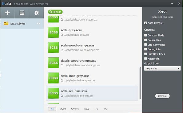
The free tool 'koala' is what I use to compile the .scss files in the scss-styles directory into .css files in the styles directory. Koala is intuitive and can be used in minutes. It's settings (especially configuring the standard output directory) and a little more difficult to master.
The picture above shows what you see if you refresh the tool (it will then look for scss files and include them in the list) and then select your .scss file. On the right column I always choose auto compile and the expanded output style. In the mid area it is shown that the output for the .scss files will be writte to the styles directory, please take notice of this as the default behaviour of Koala is to put the .css output file in the source directory,
Overrides only make sense if you need to make a small number of adjustments to an otherwise standard template. If you like to make several changes, maybe consider to make another template. I found that overrides make most sense when you use background pictures for certain sections on the screen and without modifying the .css definitions the text would not be readible.
/* Make sure that the timer screen has a uni background */
#gui_timers {
background-color:$wrapper_bg_color;
background-image:'';
}
The example above would add a solid (single color) background to the content area when the timer screen is selected. As a result all timer text and buttons can be read much better.